I’m back with another Baum Shelter update! We decided back in June to build a new home with Darling Homes, finalized our design selections a couple weeks ago, and next we’ll have our build meeting with our sales person and the building super. (See this post for an overview of our process). First we had a meeting with the cabinet people, scheduled two meetings at the design center, and had a separate meeting with the tech guy on wiring. By the second design meeting, we had to have all our decisions finalized so it all happened really quickly, but I am really happy with all the decisions we’ve made!
I was concerned about making design selections during COVID, but luckily, the design center was taking in person appointments with a designer – they weren’t allowing walk-ins, but we were scheduled two three-hour appointments and we were required to wear a mask. I loved the designer we were assigned, as soon as she figured out that I was going for a more modern look, she showed me suggestions for everything that I immediately loved. If a price point was too high, she showed us better alternatives. It can be overwhelming with so many options, but I do think having a good designer made everything so much easier. The strategy at the first meeting was to input all our first choices with some backups in mind. We went home, mulled on the choices and make the final decisions by the second meeting. At the second meeting our designer had all our choices from the first meeting laid out and we went through all of them to confirm or make changes.
The hardest decision for us was the floors. We knew we wanted wood floors in all the main areas, carpet in the rooms, and tile in the bathrooms, but wood floors are really expensive so we had to dial back the level of flooring. We ended up narrowing it down to the four options below:
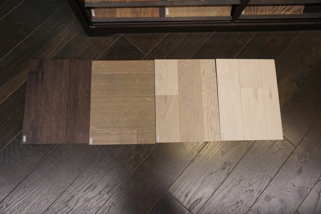
We chose the darkest floors on the left at the first meeting, but when we went home to think about it, we just kept going back and forth on the lighter floors. I looked up so many flooring pictures on Pinterest and my biggest concern was that the swatch wouldn’t translate when it was installed and I would hate the variations. We ultimately decided to go lighter because of maintenance and how bright it makes the room look. We narrowed it down to these three after putting it against our kitchen cabinet choices:
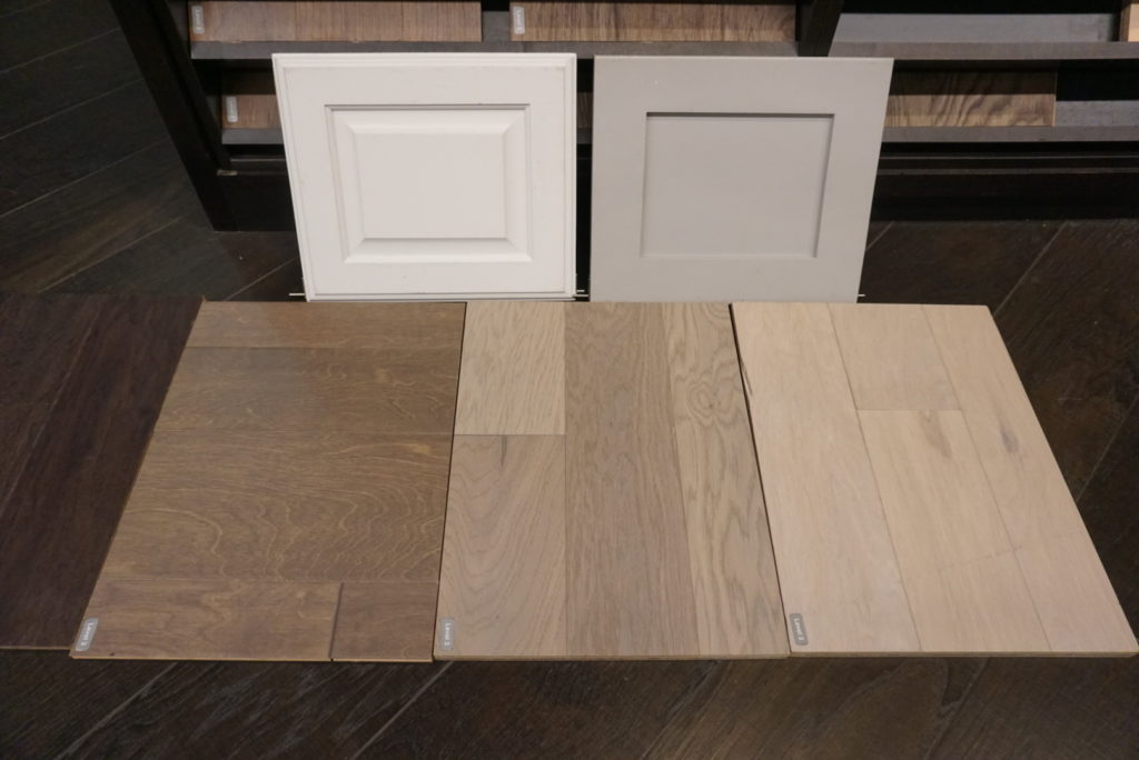
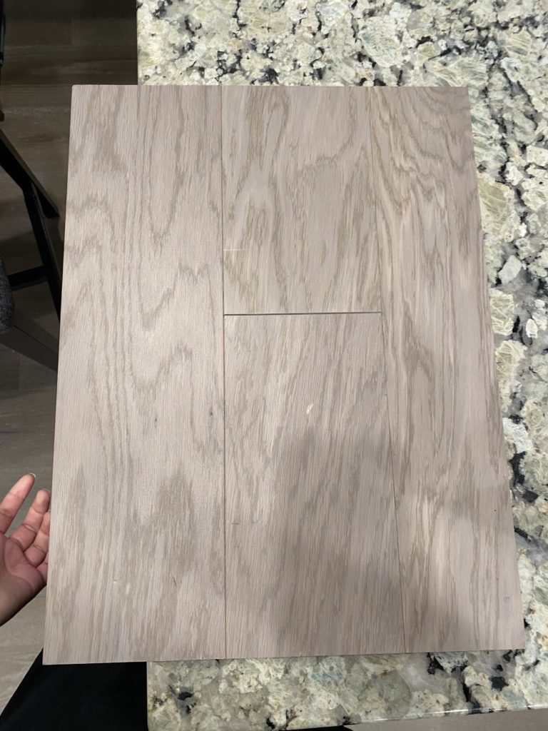
We narrowed it down to these two – Mohawk Industries Modern Lights Miami Oak and Mohawk Industries Cafè Society Froth Oak.
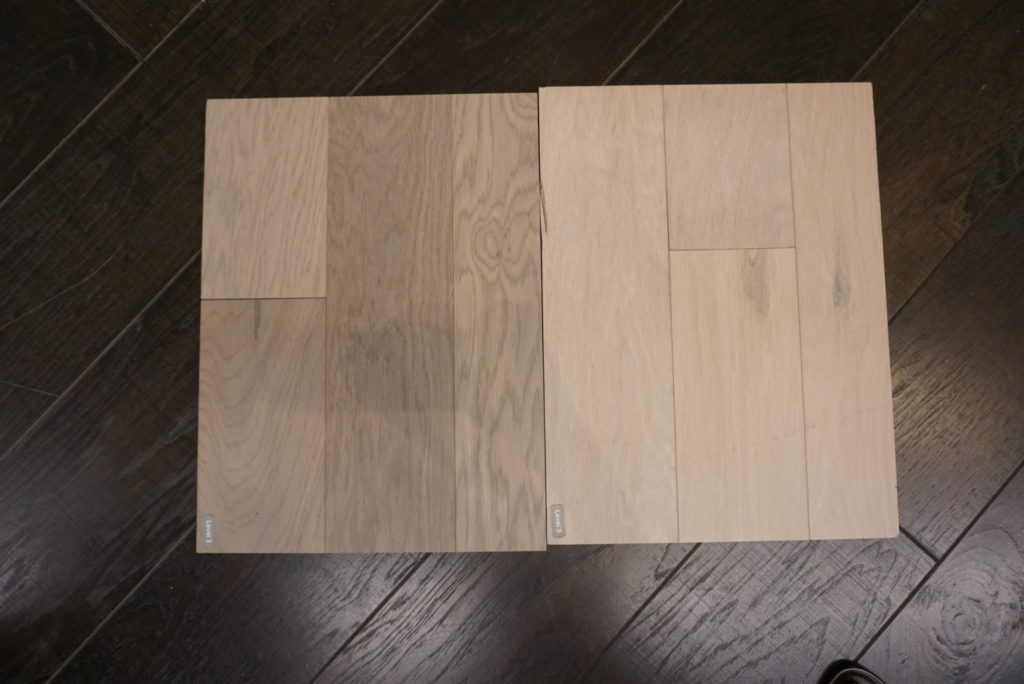
We ended up choosing the darker Miami Oak because we thought the Froth Oak would just be too light with the white cabinets. It was so hard making the decision because of different lighting! This is Adam holding up our final decision:
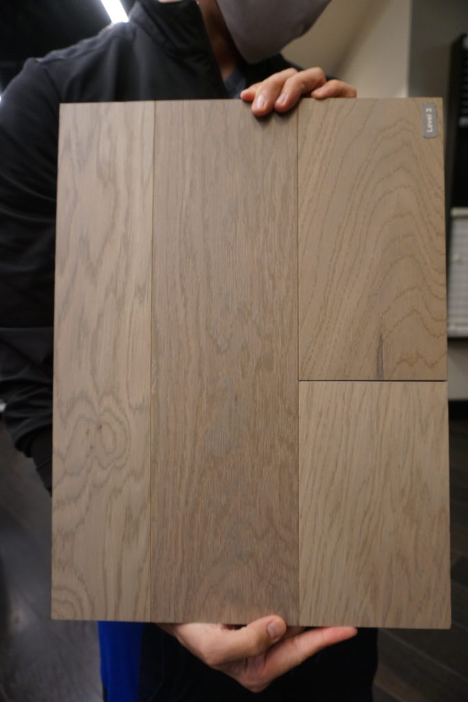
This is when we came back in the second time and took pictures in different lighting – the swatch was even slightly different than the first one we saw! But I think it’ll look really good.
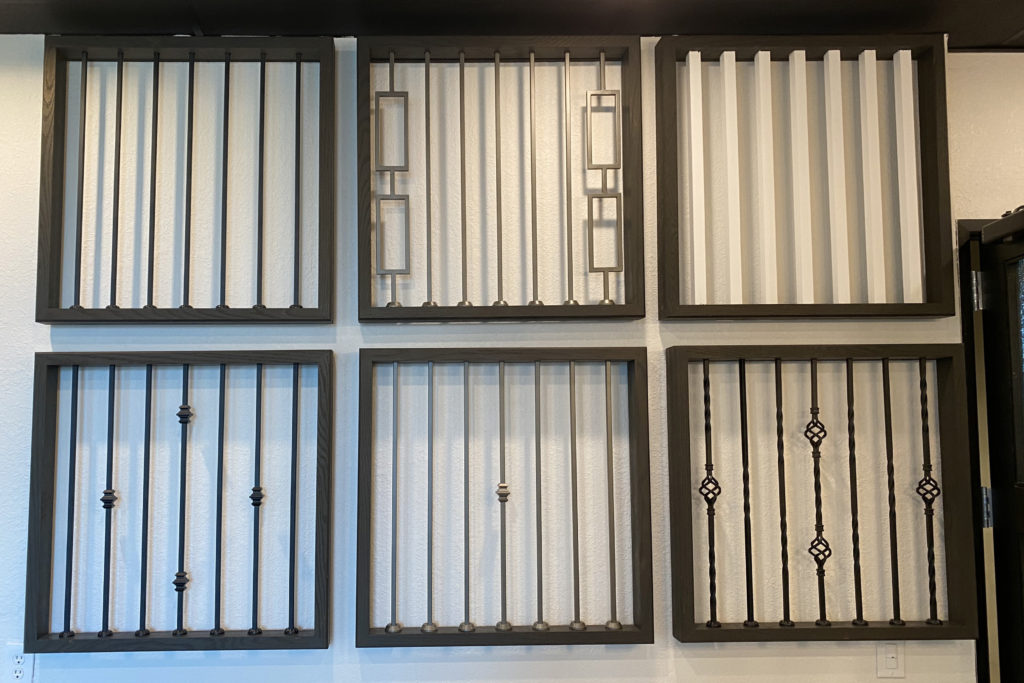
These were the baluster options we had that didn’t cost extra. Balusters are the columns on the stairs, if you didn’t know. We were originally going to go with the second row first column, but ultimately decided on the first row first column (all straight) since we thought it went more with our modern look.
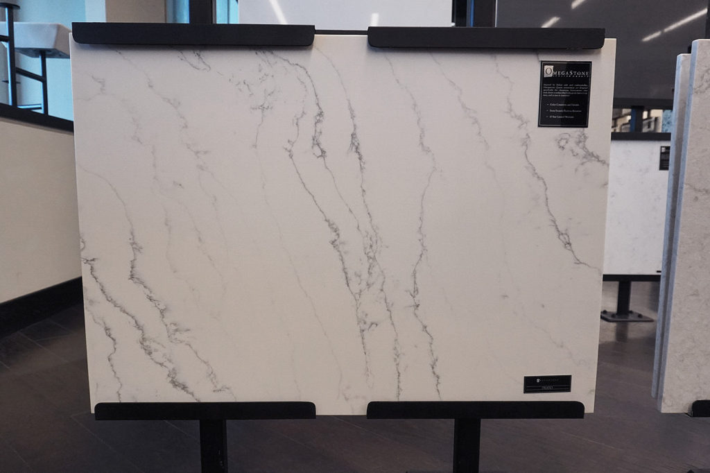
The kitchen counter was probably the easiest decision because I was absolutely set on having a waterfall counter and I’m in love with the white marbled look. We went with quartz counters in the kitchen. This is the Omega Stone in Prato:
For the cabinets, we decided to go with shaker cabinets. We opted to install cabinet pulls ourselves so we’re still in the market for those. We decided to have the island cabinets be a light gray with the wall cabinets all white. This pin was definitely inspiration:
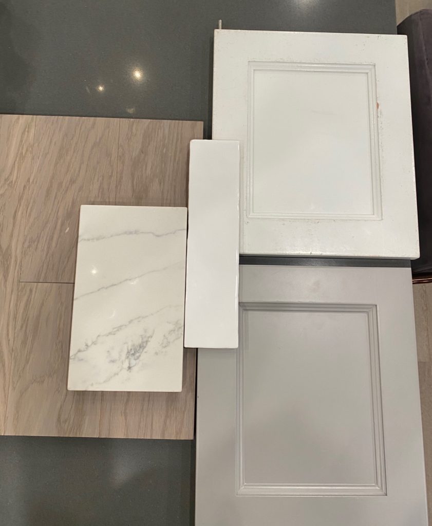
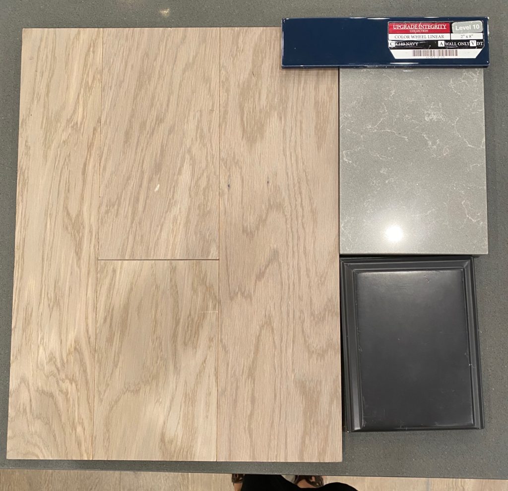
The final kitchen choices below are the wood floors we chose, a smaller swatch of the Prato counters, long white subway tile, and the white and gray swatches of the cabinets. The shaker cabinets will have a more straight edge like this. You can’t really tell from the picture but the subway tiles have a shiny texture to them, they’re called Costa Clara Cloud Wall Tile . The backsplash will be in a horizontal staggered pattern.
We also decided to go with a black faucet and sink! The pictures below aren’t the exact models but pretty similar, we went with the Moen Eva Faucet in Matte Black and the Mirado Quartz Single Blow in Black. I did do some research on maintenance before making the final decision and I don’t think it’ll be as high maintenance as a lot of people would expect.


For the wetbar/gameroom we decided to go darker and more fun. We chose a dark chocolate color for the cabinets, with grey counters (Omega Stone in Caliza), and a navy blue subway tile for the backsplash (Color Wheel in Navy). I originally wanted black cabinets but when we saw the swatch for the black next to this one, it just looked kind of flat. We opted to do the backsplash in a herringbone pattern, inspired by the pin below:
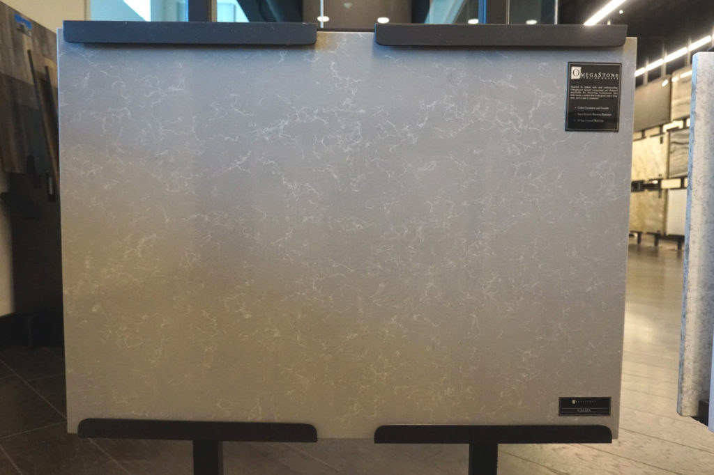
Here’s the slab of the Omega Stone in Caliza – as you can tell I’m obsessed with veining in counters. These are also quartz counters and we ended up choosing the same counters for our master bath as well.
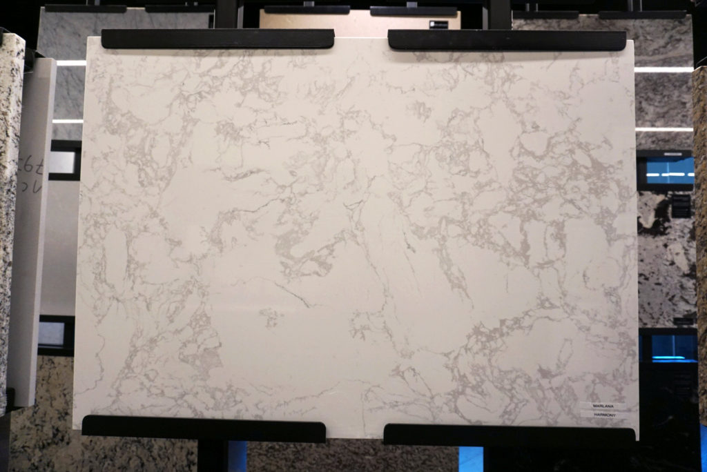
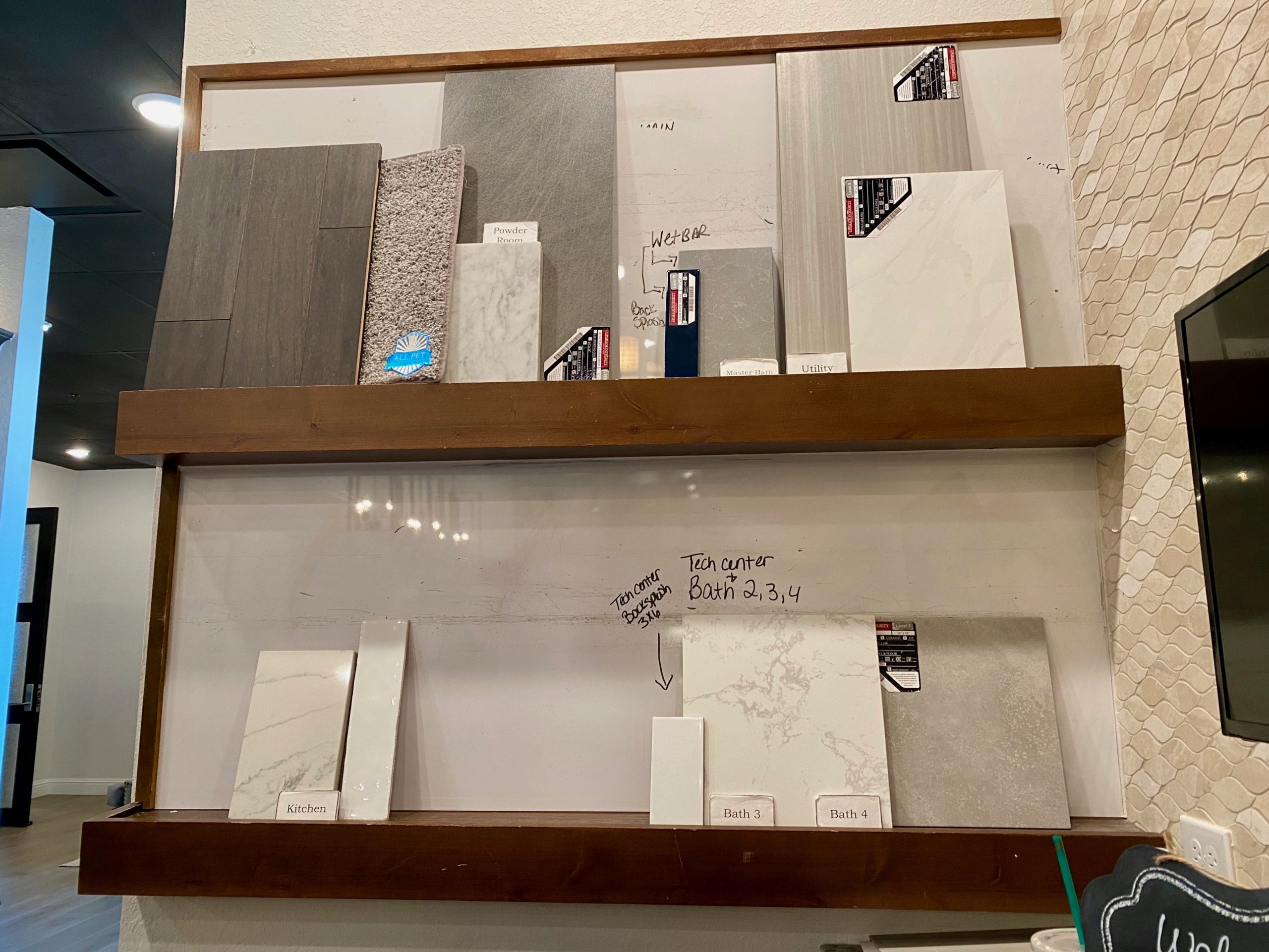
For the extra bathrooms, we opted to get engineered marble for the counters, it’s similar to marble but a lot cheaper. Cabinets are also white in all bathrooms, except for the powder half bath. There’s also a little “tech center” by one of the garage entrances that will use this same counter. These counters are the Marlana Engineered Marble in Harmony:
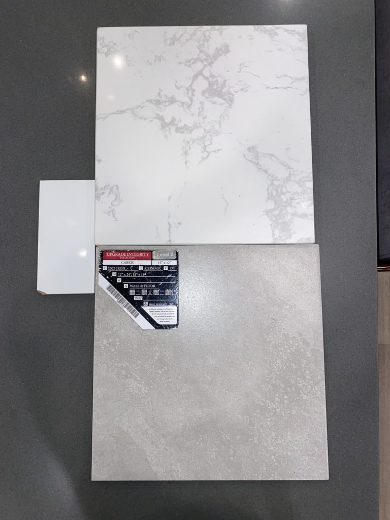
The tech center will have the short white subway tile below in the horizontal stagger. (Daltile Vitruvian 3×6 tile in Gloss White. For the extra bathrooms, we chose the gray tile on the right, Daltile Cabris 12×12 Tile in Iron, for the floors and the shower walls.
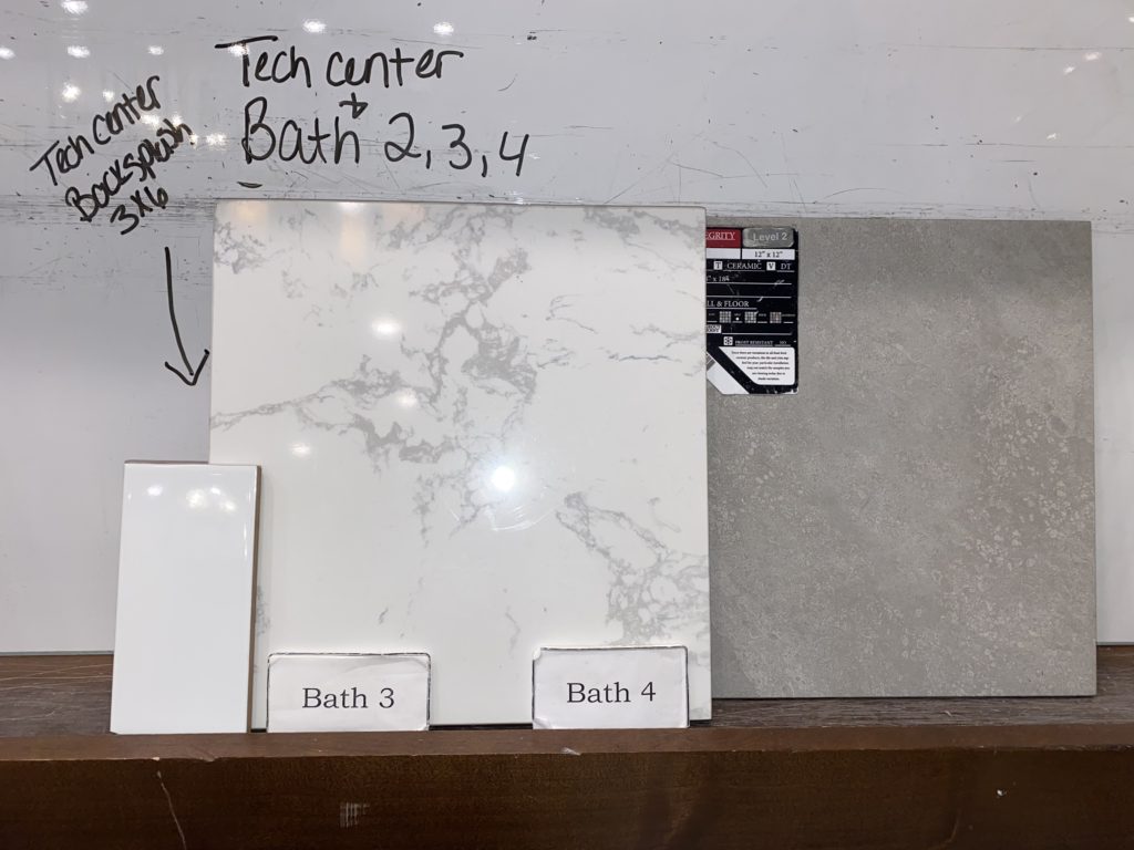
The floor tiles will be in a straight lay pattern. Here’s a flat lay of the same tiles:
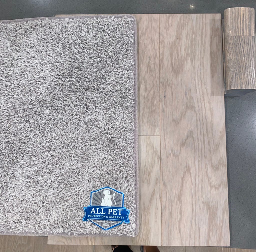
We originally wanted the stairs to be wood, but pricing for that is outrageous, so we chose to have carpeted stairs. We chose this gray carpet, Mohawk Industries Calming Dreams in Mountain Pass. This same carpet will go into all of the rooms. The wooden block to the right of the floors is the railing on the stairs.
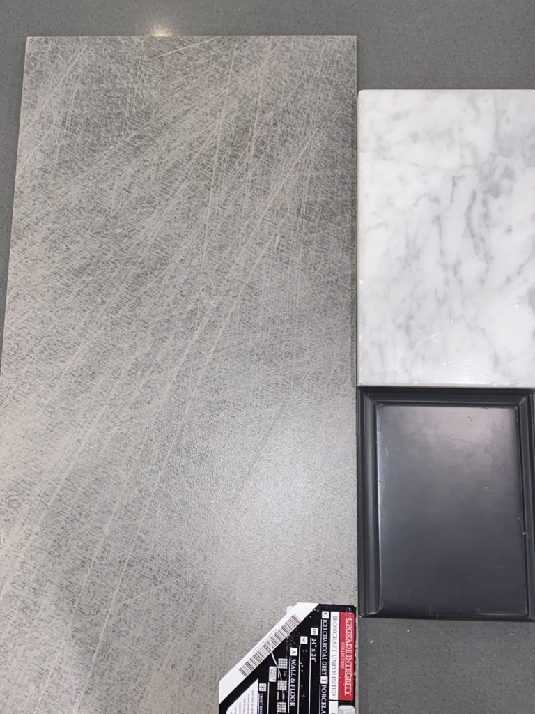
For the powder half bathroom, we wanted it to be different from the other bathrooms. We splurged on the tiles with Ironcraft Unpolished 12×24 tiles in Charcoal Gray and ended up going with a White Carrara Marble Counter. We made the cabinets the same dark chocolate color as the wetbar.
Last but not least, the Master Bathroom! Adam really wanted to upgrade to the baja shower (it’s a bigger walk in shower that has tile up to the ceiling). We chose the white marbled tile on the top left, Florentine Glossy 10×14 Wall Tile in Carrara. It’ll be set in a horizontal straight lay and the same tiles will be around the master tub skirt. The counters are the same Omega Stone in Caliza as the wetbar, and the cabinets will be the same white as the kitchen. The floor tiles are Ballatore 12×24 in Beat. The shower floor tiles will be the same but cut into 4×4 instead.
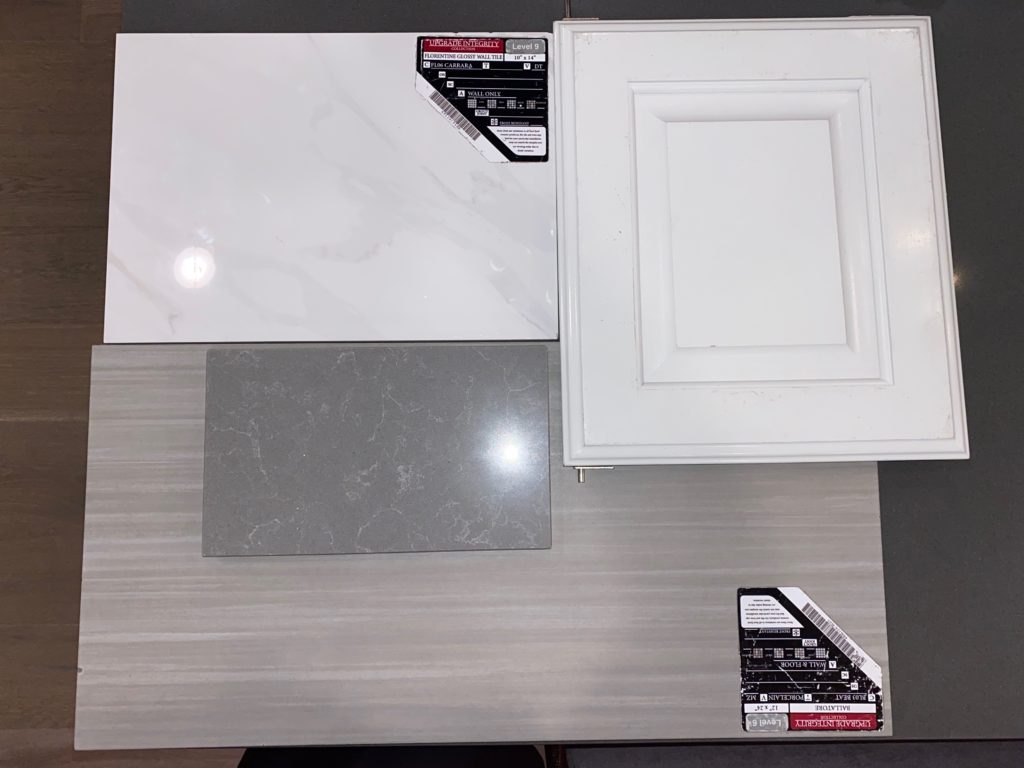
As you can see from all our choices, we pretty much have a neutral gray color palette for the entire house. We drove by our lot last weekend and there hasn’t been any work started yet. We have our builder’s meeting this week and I think from there we’ll know when they’ll officially break ground and get an ETA on the completion! Can’t wait until we can start doing weekly updates!

2 replies on “Da Baum Shelter: New Home Design Selections”
Your color palette is practically identical to mine! (Exact same master bath & secondary bath counters, similar carpet, flooring and tile selections) I so wish I would have read your posts before we went to design center but nonetheless, design is all set. I look forward to continue reading yours posts to help set expectations. You’re sure right! It adds up quick!!
[…] aesthetic reasons. (See the inspo pic above.) We weren’t sure if we could do it at all until we went to the design center and Adam so graciously let me have it! I can’t wait to see how it turns […]